
 Following on from last week's post about the Periodic Table of the Internet, here's another interesting re-imagining of the World Wide Web, this time in the form of a map of the Tokyo metro. It was created by Information Architects Japan and I think it's almost as confusing as the real thing.
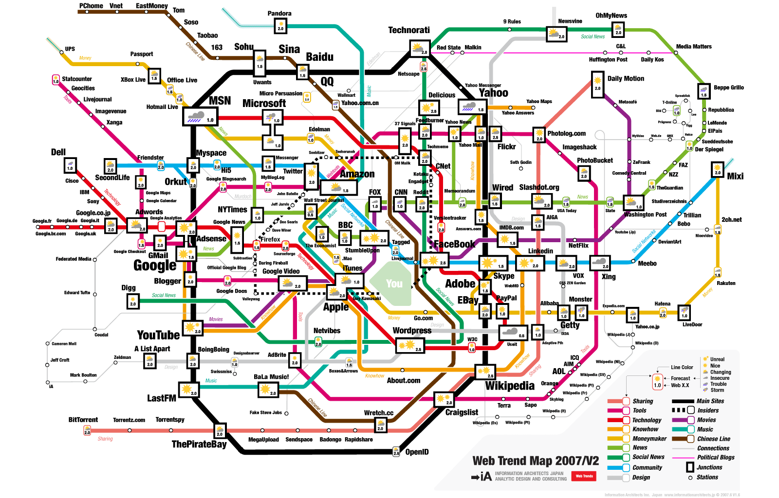
Unfortunately New Scientist is absent. Perhaps we'll have to create our own "map" of the web, just to get ourselves a prominent position.
Will Knight, online technology editor
No comments:
Post a Comment